Designing an e-commerce website is not cheap and easy task. That is why; each and every thing done on the website should be with a purpose. It should support the purpose to the extent that the purpose of website gets solved. The whole idea of designing the website lies around the fact that what a user think while going through an online shopping website. It doesn’t matter what you think when you look at the website, it’s about what a visitor think while surfing through the website. So, the website should always be designed through a user’s view point. It should be easy enough to follow, select and order. Following are some points which should be consider while designing an e-commerce website:
1: Home page should be light enough to load quickly
You should take care that at least your home/front page should be free from any heavy sized graphic and should be able to load itself within a fraction of second which can hold people to read it and in the meanwhile other pages can be loaded.
2: Graphics and pictures used should be supportive with contents
It’s a possibility that users are not finding what they are exactly looking for or they are lost on your website due to too much of graphics or images, or maybe they are not able to judge your pictures, or maybe they are irritated as it is taking too much time to load the graphics. There can be so many reasons which will make your website hard to navigate and hence will reduce the traffic. What you should take care while designing an e-commerce website is that there should not be any clueless banners.
That means any picture, graphic or banner you are posting on your website should be simple and easy enough for a layman to understand. Graphics and pictures are basically used to create the interest, so it should be supportive with your content. Remember, they are just to support the content not the website. So, your entire crux should be in written material.
3: It should match the user’s requirements
A website should always match the public it has been created for. The advertisements on the website should connect with its target customers. For example, If you design a website having too much of fancy graphics or images because you like it, it is not necessary that your viewers will also like it.
4: Informative and Quality Content
To increase the number of pages to hold the customers is a good idea but there should not be so many pages which force the people to leave the website without getting the real information. Your written content should be short and precise, should be to the point so that the visitor can get the desired information. There should not be too much of verbal information as some people find it very boring and lose their interest quickly. Use of too many technical terms should also be avoided as it will limit your viewers.
5: Use Filters
Filters work all the time. It should be handy and easy enough to locate the particular item on your website which the customer is looking for. You can design a particular pathway for the visitors to make it easy for them. For example, if somebody is looking for a blue colored ladies jeans, it should be directly accessible under ladies clothing-jeans-blue color pathway. This will make your website much more accessible by the visitor. Also, removing the filter should be an option there. As many websites don’t have that option and the customer has to reload the pages again and again to remove those filters which is a complete waste of time.
6: Easy Payment options
Payment options should also be as easy as the segregation of the products under their tag. There should be an easy payment gateway which accepts all types of major credit and debit cards. Sometimes, it can happen that the customer doesn’t have that card which is accepted on your website resulting in the cancelling of the order.
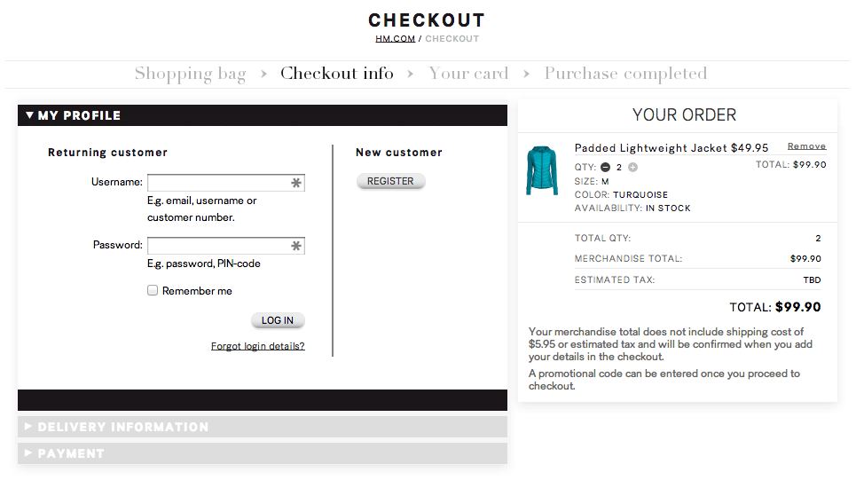
7: Differentiate between new and old customers
There should be a strategic scenario to differentiate between new customers and already acquired customers so as you can serve them accordingly. Cross selling can be very easy due to this kind of strategy.
8: Marketing Activities and Promotional Offers
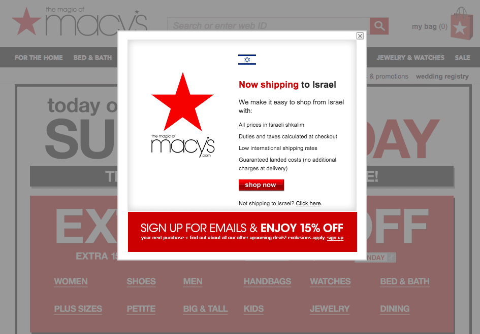
There should also be some attractive marketing offers for the customers to engage them and to compel them so that they place orders. It works every time. E.g., you can give some points on every purchase of above Rs 500 or Rs. 1000 and after a collection of certain points, customer can redeem them or else you can gift them a small accessory on purchase of a particular amount. You can also use the moving banners or flashing icons on the starting page of your website which is very useful, but don’t use them deeper in your website.
9: Easy links and Regular Updates
The links given on every page should be very easy to use. Update the website and the offers on a usual and regular basis to make the visitor visit your website again and again out of curiosity.
10: Customer’s Feedback
Feedback from the people who are using the website always gives us a good chance to improve our website. A tab or column asking for a feedback or evaluation should always be there. This not only gives a feeling of security to the customers but also gives you the points to work upon from a customer’s point of view. Evaluate the results, feedback, designs and offers continually to fix the loopholes.
What do you think about these tips, please let me know in the comment. If you find these tips useful, I would be glad to know your experiences on optimizing the ecommerce website for conversion. Enjoy reading more tips and useful optimization articles on this blog.

